The aim of this project was to better understand colour and lighting of a scene to convey mood through practical lighting experiments. I experimented with a variety of media to produce maquettes and models to use as lighting reference. I also looked into the technical and theoretical aspects of the subject of colour and lighting to better inform myself when it came to constructing the maquettes themselves.
I created a variety of maquettes from different materials and through process of elimination I arrived at lighting an outdoor scene, looking at examples of the way in which some of my favourite landscape painters have used light and time of day to convey mood. I decided to make a scale model of my chosen composition to photograph in natural outdoor lighting. Through my practical experimentation I arrived at the stage of making up colour roughs of the three variations of a scene to see how they read differently. Although I would have liked to have painted them up completely, I feel that I have learnt much of what I could have learnt by getting to this stage in the process. If I were to continue further I would place figures in the scene to see how interactions and narratives can be read differently in different light and colour schemes.
Further experiments I would have liked to do during the process would be to employ the knowledge of creating a gamut mask that I learned from James Gurney's tutorials and publications, to see more specifically how colour affects a composition. I would also like to have made more detailed models of my faun figures and light them for more detailed imagery.
Overall, I feel like I have learnt a great deal from this investigation into light and colour, and it is definitely and area I would look into further in improving the quality of my work. I would also be likely to employ the use of maquettes for lighting reference for future pieces as I felt this was a very informative exercise.

A blog documenting the progress of my project in my final year of BA Illustration.
29 April 2012
24 April 2012
Colour Roughs


Above are my colour roughs for the three different lightings of the same scene. As you can see, the way lighting of the time of day, as well as the way shadows fall has a great effect on how a scene is interpreted. The top composition with direct sunlight creates the impression of a pleasant, normal, everyday setting; the overcast lighting creates the impression of a dull, dreary place, that is either a boring place to be in, or something sad is taking place; the night time scene can either be read as creepy or giving the implication of a metropolitan place with a night culture.
10 April 2012
Black and White Roughs


To better understand my physical experiments with lighting a scene I have done black and white rough studies of how some of the most effective lighting schemes effect the way you read the composition. In the compositions on the right, large shadows are being cast, creating dramatic effects. Lighting schemes with large shadows being cast over the scene have a sense of drama and create an ambiguous and mysterious mood in the piece. The compositions on the right have smaller amounts of shadow and create areas of interest in where shadow does and does not fall, here the areas of shadow could be used to narrative effect in placing certain characters and interactions in these shadows to imply something of what is taking place. I feel that this exercise has been helpful in creating options for how I want to light a scene and is definitely something I would try again in future compositions to aid in the single image storytelling that I prefer.
Next I want to use some of these lighting schemes together with the various colour palettes of the times of day I outlined in a previous post to see how this effects the mood of the scenery.
29 March 2012
Constructing A Model For Lighting Reference
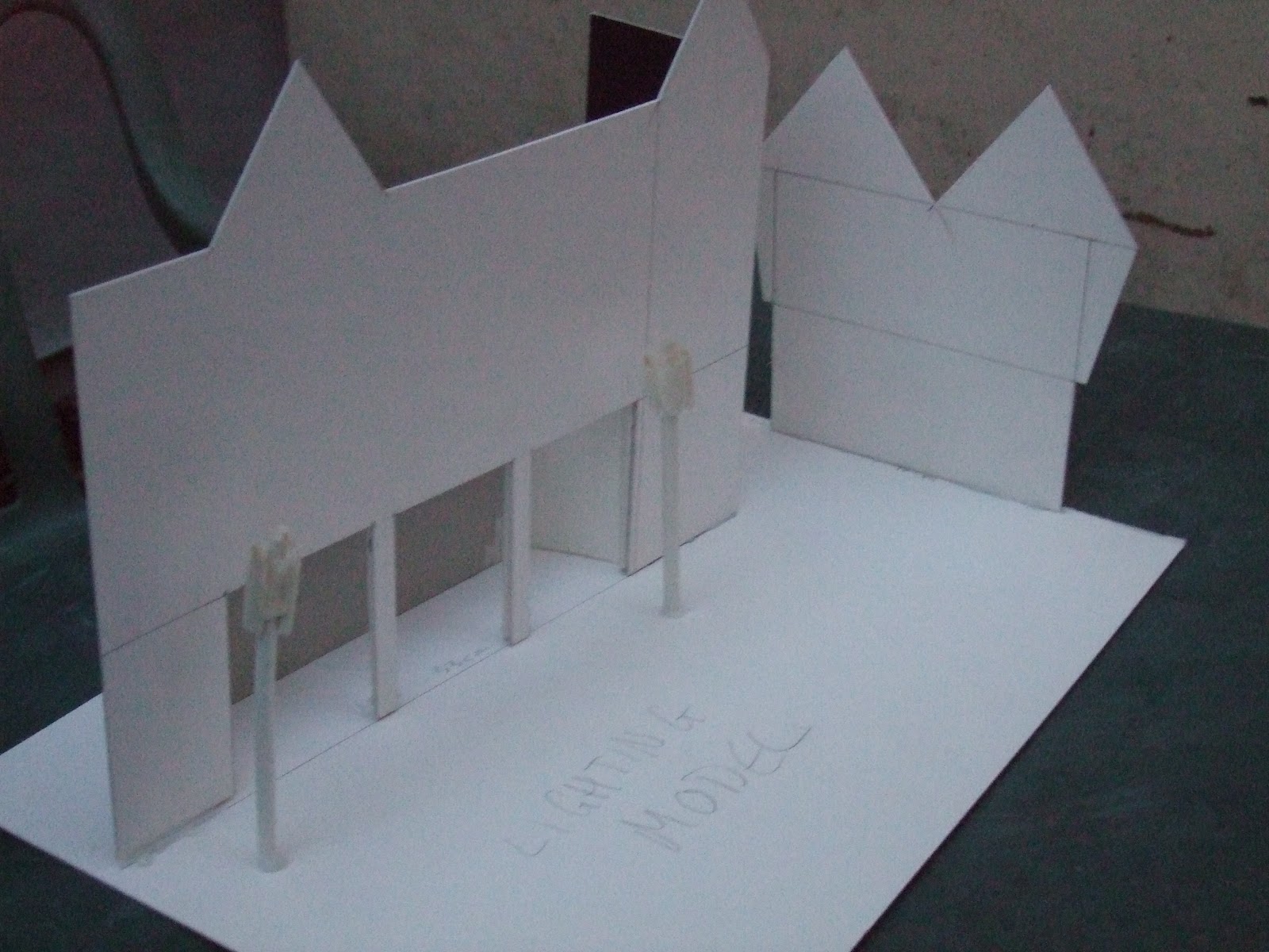
For my experimentation with making models for lighting reference I have chosen to create artwork of the same scene, lit in various different ways, to see how it effects the way the composition is read. I began by choosing the composition from my Major Project that I wanted to use as a subject for my experimentation (pictured below). I chose this composition as I wanted to experiment with the way natural light casts shadows and it is an outdoor scene, enabling me to do that. It also has elements that could cast large shadows, drastically altering the composition depending on the directional lighting.

After choosing the composition that I wanted to use, I then constructed a rough 3-dimensional model of the main forms that would cast shadow within the composition.


I constructed the model using card, off-cuts of board, paper straws and hot-glue. I then took my model outside, photographing it in different lighting conditions and angled at different positions in relation to the sun, to cast shadows in different directions.


This exercise has been really helpful in showing me the way in which shadows are softer in overcast and twilight conditions and how drastically the lighting can affect the look of a scene. The next stage of my investigation is to make black and white thumbnails of the most effective lighting schemes to look more closely at how the lighting affects the reading of scenery.
01 March 2012
Looking at Lighting Schemes
For the main body of experimentation I will be referencing and painting the same composition in three different lighting schemes. The composition I've chosen is an outdoor street scene, lending itself to three schemes based on weather and time of day. The three schemes I have chosen are Direct Sunlight, Overcast Light, and night time with street lights, giving me the opportunity to look at both natural and artificial light sources.
Direct sunlight is the lighting on a clear, sunny day. The light comes from three sources: the sun, the sky, and the reflected light from illuminated objects. The light from the sun being the strongest source. This lighting scheme is characterised by blue skies and dark shadows. Shadows become greyer as the sky becomes cloudier.
With overcast light, the layer of clouds in the sky diffuse the sunlight, evening out tones and removing dark, contrasting shadows. This lighting scheme makes complex outdoor scenes easier to paint as there is less contrast in tones and colours can be kept faithful to the colour of the object.
Night scenes have a great contrast of blues and yellows. The moon gives off a blue green light and artificial lights give off orange, yellow and white light depending on the type and intensity of lighting. To create a more convincing an easily read painting, blacks should be used sparingly as night time street scenes are scene in blues to the naked eye.
My research into these lighting schemes will help me with identifying the lighting conditions that are best for photographing my references. My next step is to make colour roughs of the composition and create and shoot the necessary reference for the composition.
Direct sunlight is the lighting on a clear, sunny day. The light comes from three sources: the sun, the sky, and the reflected light from illuminated objects. The light from the sun being the strongest source. This lighting scheme is characterised by blue skies and dark shadows. Shadows become greyer as the sky becomes cloudier.
 |
| The Oyster Gatherers of Cancale John Singer Sargent |
 |
| Breakwater at Trouville, Low Tide Claude Monet |
 |
| The Cafe Terrace on the Place du Forum Vicent van Gogh |
26 January 2012
Lighting The Face


In figure drawing for all it's worth Andrew Loomis discusses the ways in which lighting the face from different directions can affect the composition and recognition of the form.

18 January 2012
Colour Schemes and Gamut Masks
In this post I will be talking about gamut masks and colour schemes. Gamut mapping and creating gamut masks is something that can help me a great deal with my colour compositions and is a simple way to generate coherent colour schemes for my paintings. A gamut is the range of colours contained within a painting and can be represented by a polygon over a colour wheel. Illustrator and painter James Gurney explains gamut masking in this video.


Restricting the palette helps bring the painting together and create mood, despite this you can still create the impression of a range of colours due to colour constancy where a colour can appear different depending on the surrounding colours. This is demonstrated in Gurney's box diagram.

The blue square in the bottom corner of the left box and the pink square in the top corner of the right box are in fact the colour, but appear to be different because of the surrounding hues. The colour used is blue or pink relative to its neighbouring colours.
A useful tool for generating gamuts can be found at http://www.livepaintinglessons.com/gamutmask.php .

With this online tool you can make your own gamut mask and print it off.

In this gamut I have annotated the colours within it that appear as the primary, secondary and neutral colours. In a triangular gamut, forming a triad colour scheme, the colours in the corners are of highest chroma the secondaries in any triadic gamut will be of lower chroma as they are closer to the grey centre. This phenomenon is known as saturation cost.
Within Photoshop there is another useful tool for creating colour schemes called Kuler. With this palette you can create a custom colour scheme which you can save or add to your swatches.

The final tool I have found for generating colour schemes can be found at http://www.degraeve.com/color-palette/ . With this tool you can extract colour schemes from images of your choice, which you can then use in your own work.

Subscribe to:
Comments (Atom)